Create a customized switch button in React with hooks and styled-components
Github code here! (Switch to the branch named Switch-Button)
In this basic tutorial I'll show you how to easily customize a switch button in React and styled-components, like this picture below:

The Basic Component
Start by simply creating an input of type checkbox inside a label, and put a simple span component under it:
Style it out
- Let's start by summoning styled-components and naming the components. In the example I named the label as "Switch", the input as "Input", and the span as "Slider".
2. In the parent component (Switch), let's start by setting it as position relative, setting it as inline-block and giving it some height and width. Let's also give a white background to the component, and give it a border-radius.
Now the component started resembling a switch button a little more:

3. As we're going to toggle the colours when clicking the component, let's create a state called "toggle", so we can know when the user clicked it.
Let's also create a variable called color that we're gonna use to pass the color to the component. Let's define them both as props, and initialize toggle as false, and color as #6ab04c" (you can use any color you like here).
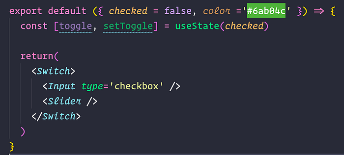
Let's pass toggle and color to Slider, and pass color to Input, so we can do some styled-components' magic.
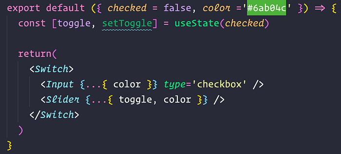
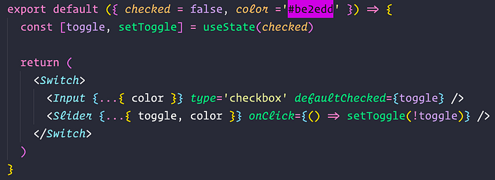
Let's trigger setToggle with onClick when the user clicks on Slider in order to change the state. Let's also pass toggle to defaultChecked on Input, to define if the component will be checked when rendered or not.
4. Now let's style the Slider component. Let's define it as position absolute, and give a 0 value to top, bottom, left and right so it can spread entirely. Let's give it a color based on toggle. It the user clicks on it, it changes the color from white to the passed color. (styled-components magic). Let's give it a transition of 0.4s, and do the same to the Switch component (as well as changing the color based on the props passed):
Now our component looks like this:

5. Now, let's complement the Slider component by creating the circle which will move from left to right when the user clicks the component. For this we are gonna use the "before" selector, styling it into a little circle. We'll also give it a transition time, and place it in the center by using absolute positioning. To finalize, let's toggle it's color as we did before, but in an opposite way, giving it the passed color when not clicked, and white when clicked:
Now we have this:

6. Now let's move this circle from left to right. For this we are going to style the Input component. First, we are going to use the checked selector so we can do something when the component is checked.
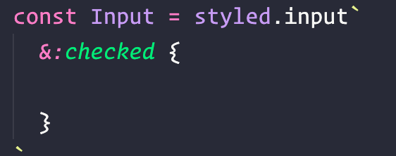
Now, we are going to use the + selector, to reach the circle inside the component Slider (that was defined on the before selector).
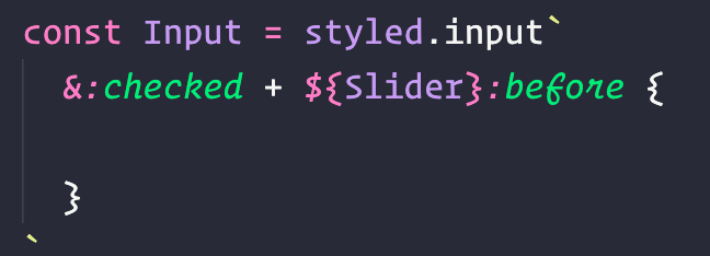
Now that we reached it, let's use translateX to move it in from left to right when checked:

7. Our component is almost finished. Now we just have to hide the input checkbox, so for this let's just reference the component Input inside the component Switch, and hide it completely by giving a width, height and opacity of 0:

We are done!!
Congratulations, you've just created a cool switch button.
